Overview
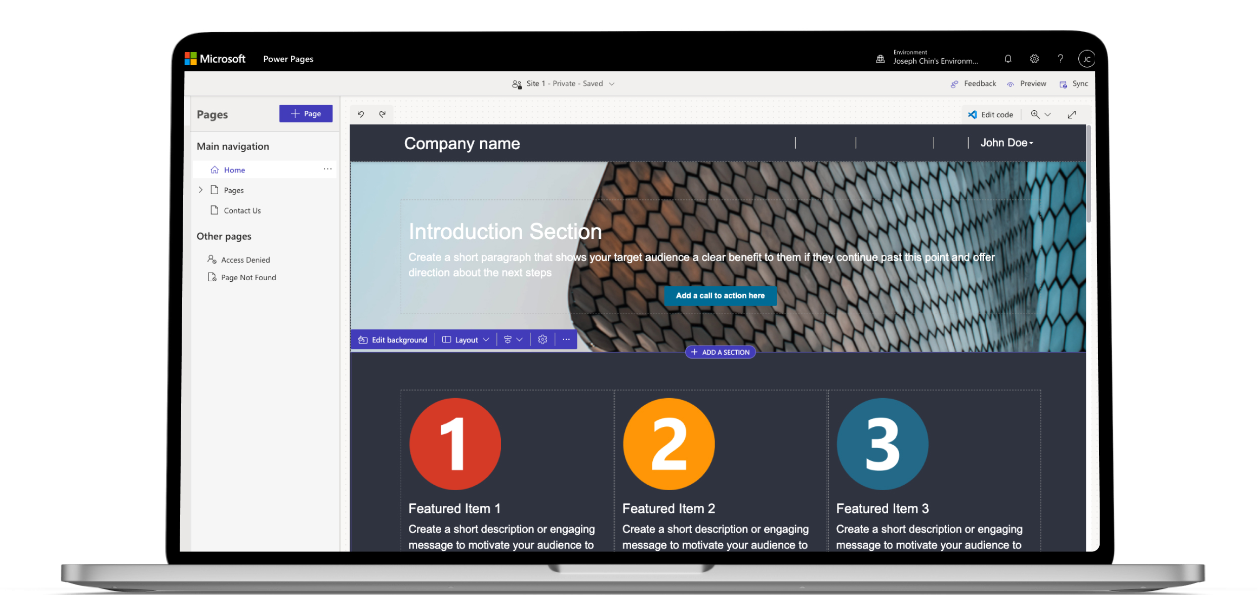
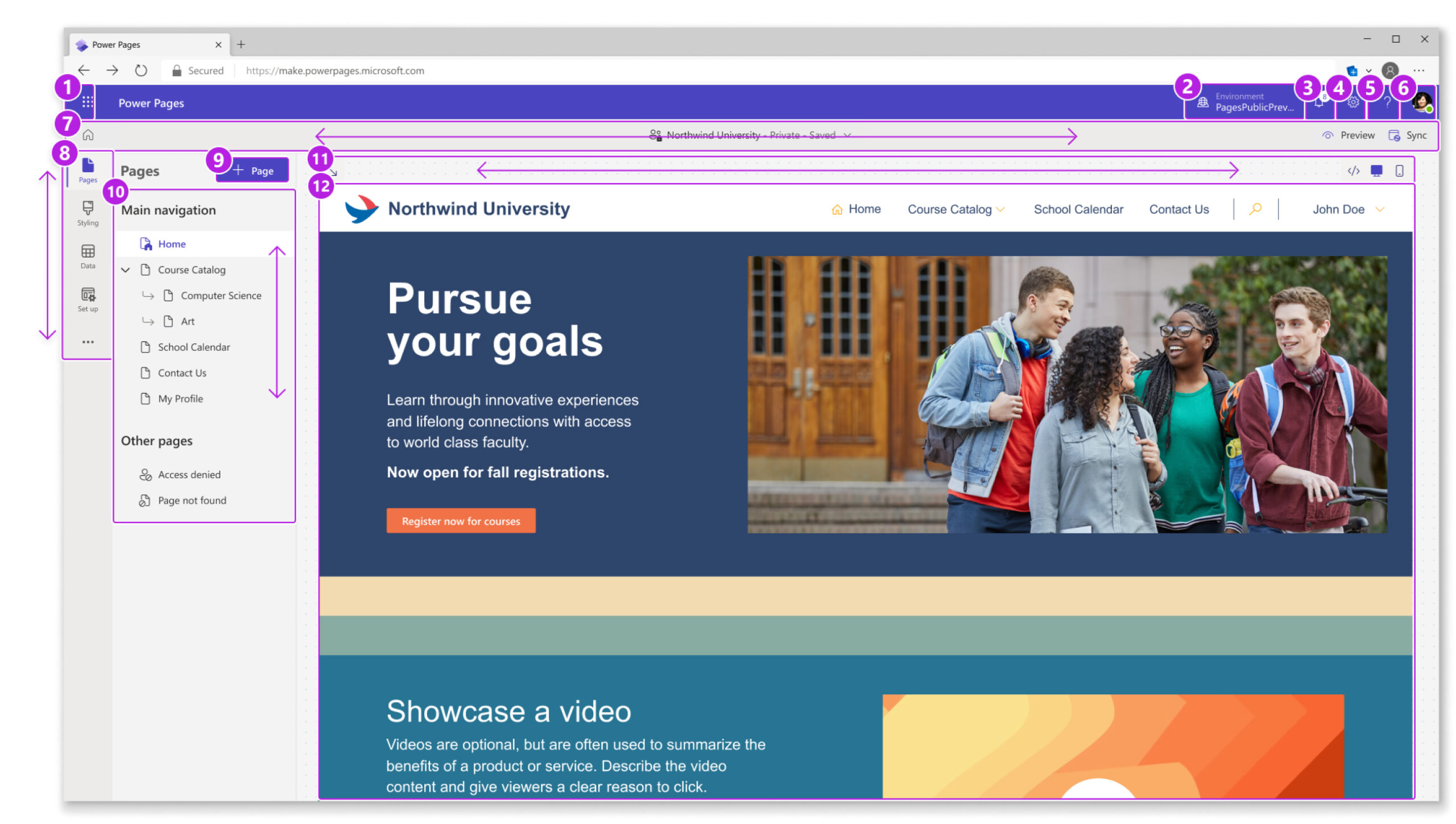
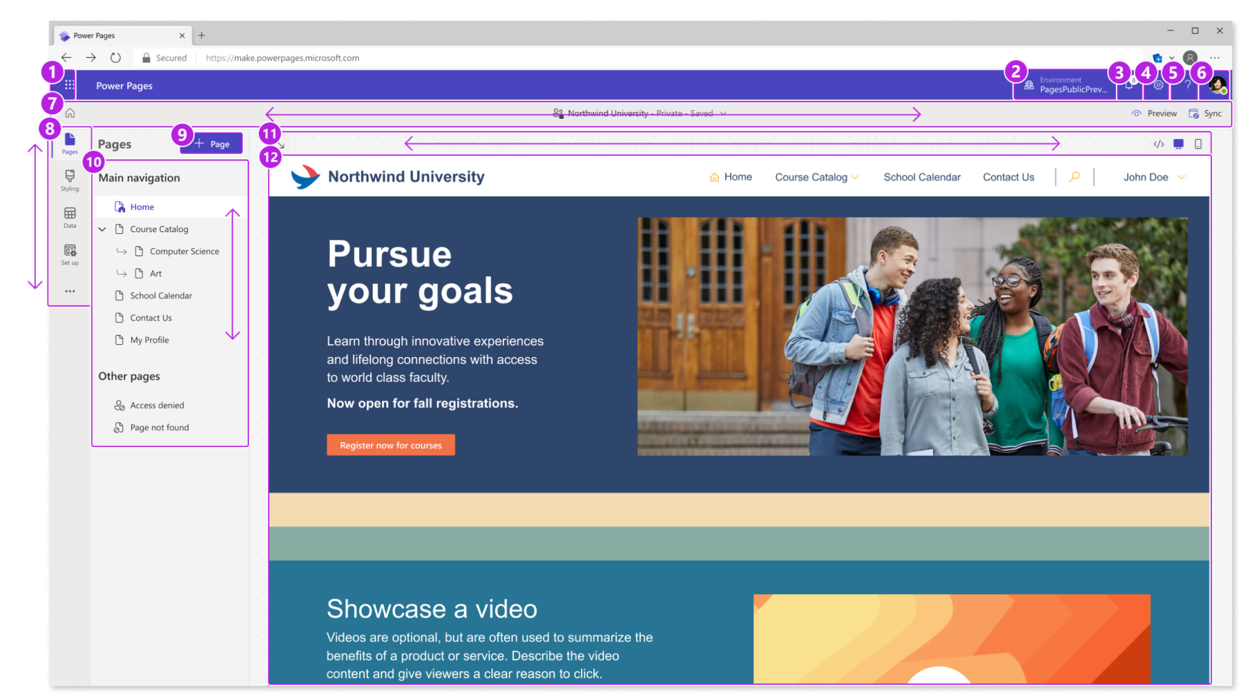
Power Pages is an enterprise-grade low-code SaaS Platform for creating, hosting, and administrating rich business websites worldwide.
My role was to support the Power Pages Design Studio with design solutions, prototypes, and research. A large part of supporting the Design Studio included learning best accessibility practices, establishing design patterns, and contributing to the existing primary library.
Role: UX Designer
Timeline: 7 months
Team: Power Pages Design Studio
Tools: Figma, Microsoft 365
"Accessibility is not a bolt-on. It's something that must be built into every product we make so that our products work for everyone – only then will we empower every person and every organization on the planet to achieve more. This is the inclusive culture we aspire to creat." - Satya Nadella
What is A11y Design?
Accessibility – A11y for short – in design is the design process in which the needs of people with disabilities are consdered. It's to ensure that people with disabilities have the same amount of access to websites and other digital products as a person with no disabilities.
Why does it matter?
Microsoft and its clients are large enterprise corporations and governments. The implications of having accessible and inclusive websites are massive, affecting revenue, discoverability, and legal ramifications.
It's Good for Business
Opportunity
Compliance
$13 trillion a year is left on the table, and over 1billion people who are underserved.
Only 4% of companies are actively designing products for people with disabilites.
4,055 lawsuits were filed in the U.S. under the ADA and California's Unruh Act. It's predicted that cases may increase to 4,400 by the end of 2022.
Power Pages Timeline and Challenge
It was a priority to get Microsoft's Accessibility Standard (MAS) to Grade C (compliance) by October, which was when Power Pages would become generally available to the public.

Early 2022
Power Pages in private preview, non-compliant, Grade F by default.

June 2022
Identifying key a11y problems + creating solutions with cross-functional partners:
- PMs
- Cloud + AI A11y Team
- Developers
- Design Studios from Power Pages and other Power Platforms

August 2022
- Bug bashing (discover & file bugs in Power pages)
- Ensure design and live code are consistent
- Devs fix Sev1 + Sev2 bugs

October 2022
A fully compliant Power Pages is shipped and made available to the general public!
Approach
We worked in 2-week sprints. Team-wide design reviews were held once a week, and product-wide reviews were held twice a week. I also worked closely with the C+AI A11y Team on average once a week to receive guidance and feedback. This iterative process of discovery, design, and feedback allowed us to address potential problems and blindspots within our designs, leading to less bugs and snipping potential issues in the bud.
Discovery

Design

Feedback

Iterate
Main Persona
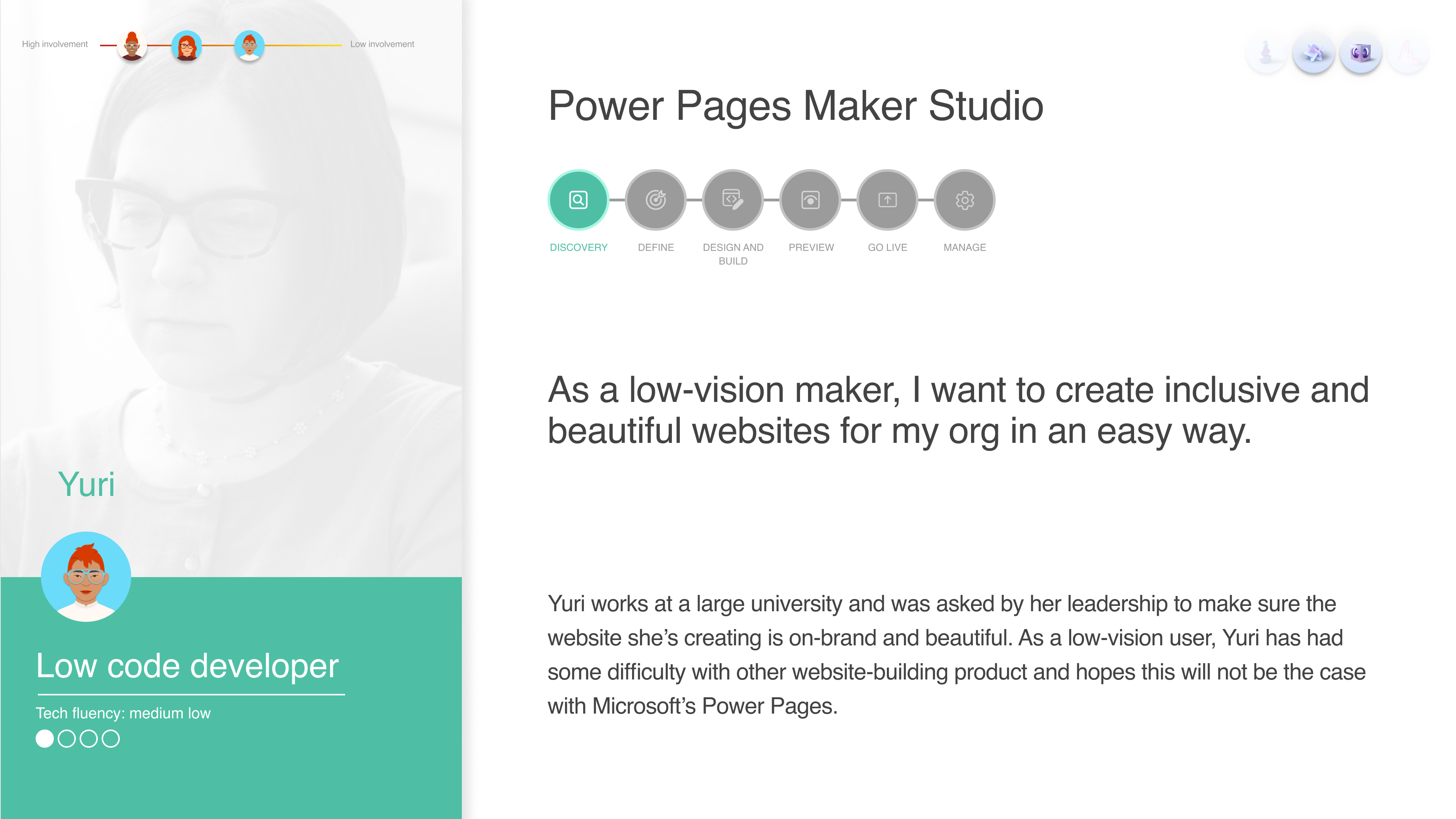
We had many personas to design for, but our main persona was Yuri, the low-code maker with a visual impairment. A maker is who we refer to as a Power Pages user.
Establishing Patterns
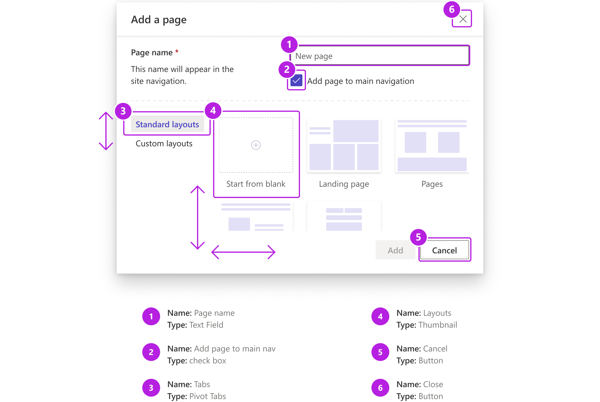
While reviewing responsive 400% zoom designs with the C+AI A11y Team, I encountered an issue with the pivot tabs in modals. The design at the time for selected tabs was to put a grey background behind the tab and change the font color to Power Pages' primary theme color.

The highlighted background was not enough to indicate that a tab was selected for low-vision users.

The solution was to use a french fry as a more prominent visual marker.
This solution extended to modals at normal resolution and became an established pattern in the Power Pages primary library.

Responsive Design: 400% Zoom
It was imperative to design screens up to 400% zoom or 320px width in order to meet Microsoft's Accessibility Standards (MAS) by general availability.
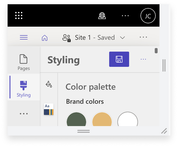
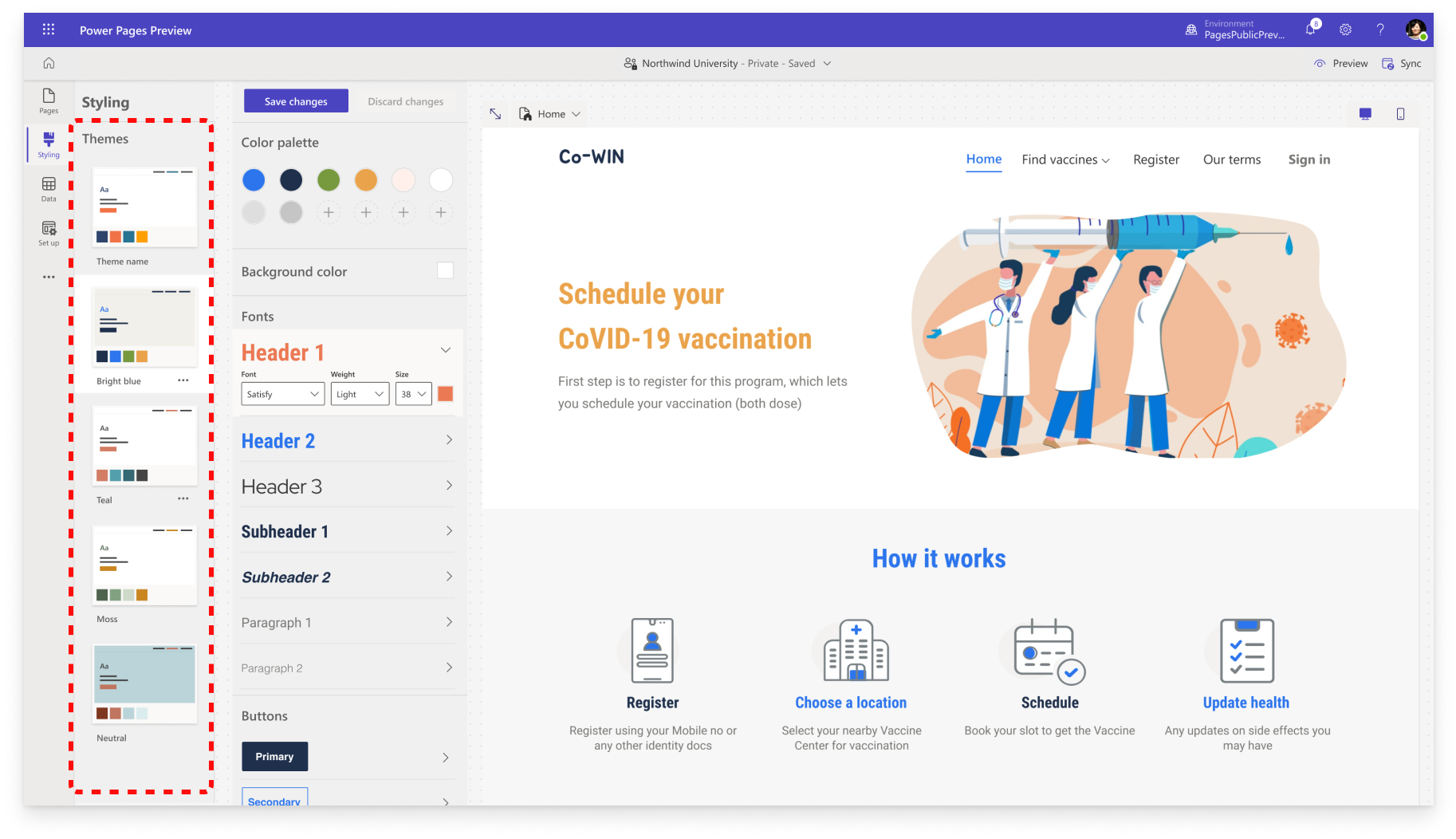
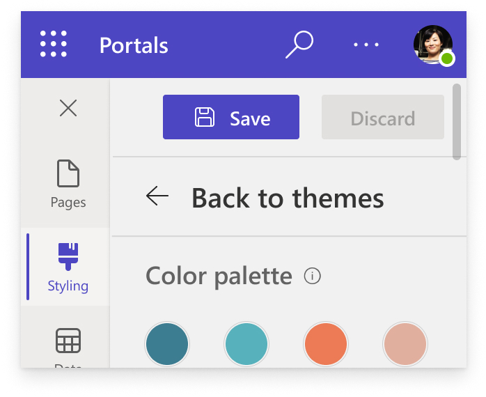
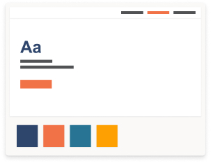
One example of 400% zoom work I've done happened in the Styling Workspace. Makers can use out-of-the-box themes to personalize the branding of their site with colors, typography, and other interface elements.
The goal here was to create 400% zoom versions of the theme cards.
This was the flow to access theme cards at 400% zoom:
Select theme > start customizing color palette > back to themes to select other theme cards.
Problem: Makers would have to keep switching back and forth between theme cards and color palettes. They would not be able to view changes in real-time like in normal resolution, severely increasing the number of clicks and creating a time-consuming experience for low-vision makers.
How might we allow the theme cards to be accessible on the same page as the color palette?
Fortunately, a large company like Microsoft already had many compliant products that I could refer to for most of my comparative research. This allowed me to keep the design language, interactions, and responsive designs consistent.
I adopted the same collapsable interaction with the theme cards. After receiving feedback from devs, PMs, and other designers, we agreed on the following:
- remove collapsable interaction altogether
- utilize the column in between the side nav and color palette and insert smaller theme cards
The final shipped design allowed our makers to scroll through and select theme cards while viewing changes in the color palette in real-time.
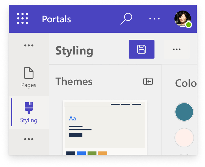
Collapsable theme cards

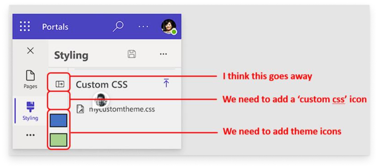
Feedback from partners


Live code
Keyboard Navigation
Low-vision and blind users are able to easily navigate a website through the use of keyboards and other specialized tools.
Power Pages is a complex website-building tool where there are multiple layers to navigate through using just a keyboard. I worked with the C+AI a11y team and devs to establish a tabbing order. We tested with low-vision partners and a11y experts within the C+AI team, and together we established a proper tabbing pattern, focus traps, and keyboard shortcuts.
Power Pages Outcomes
Power Pages launched successfully and fully compliant in October 2022 with MAS Grade C.
We achieved an increase of 18% in accessibility rating after comparing benchark scores from Febrary 2022 and November 2022.
This helped bring Power Pages' SUS score of 73% in February up to 85% in November.
Learnings
Leverage the work of other designers/experts and create opportunities for other designers to leverage my own work. This leads to opportunities of learning and building a sense of community.
Having a constant feedback loop with designers and cross-functional is vital to producing a sound, working solution.
It takes $100 to fix a bug at the design stage, $1,000 at the development stage, and $10,000 at the production stage.
Prioritizing feedback from experts and testing for potential bugs early + often will save time and resources.
Next Steps
Towards the end of my contract, I finished creating a deck outlining a proposed integration with a company specializing in accessibility tools. Due to the sensitive nature of the project, I’m unable to share details, but the work I did included:
- A deep-dive into product-market fit between the a11y product + Power Pages
- Detailed comp study of competitors in the market
- Explorations of use cases and scenarios
- Explorative designs for an app market for Power Pages
Including continuing integration work, my next goals would have been the following:
- Plan for Grade B MAS a11y rating
- Additional a11y features
- Corporate branding work in the Styling Wokspace
